Designers and paint brands are shifting away from cool grays and stark whites toward warmer, nature-rooted, expressive color palettes. Here’s what’s trending right now:
1. Warm Neutrals & Earth Tones
- Warm beiges, taupes, greige, creamy ivories — think inviting, snug backdrops.
- Earthy browns & terracotta/mahogany add richness and depth.
2. Nature-Inspired Greens & Blues
- Sage, olive, eucalyptus, smoky jade, and deep forest greens ground spaces with a calm, organic feel.
- Blue-greens and slate blues bring serene coolness without feeling stark.
3. Moody & Rich Accents
- Plum, burgundy, deep blues, and dramatic jewel tones make bold accent walls or feature ceilings.
4. Soft Pastels & Refined Shades
- Muted lavenders, dusty blushes, and gentle pastels offer subtle warmth and an approachable palette.
5. Tonal & Connected Spaces
- Rather than matching one hue everywhere, designers suggest related color families that flow room-to-room — deeper in one area, lighter in another but rooted in the same undertones.
How to Match Window Treatments With 2026 Paint Trends
Window treatments are more than functional — they help tie a room’s whole look together. Here’s how to pair them with these color trends:
Warm Neutrals → Textured Neutrals
If your walls are in warm beige or creamy tones:
- Linen or natural cotton drapes in soft cream/beige or light stone harmonize seamlessly.
- Roman shades in woven textures (grasscloth, bamboo) add subtle pattern and warmth without contrast.
Why it works: Keeps the palette calm and unified, emphasizing texture over stark color contrast.
Earthy Greens & Blues → Natural & Organic Layers
For walls in sage, eucalyptus, or smoky jade:
- Earth-toned linens (taupe, olive, latte) enhance the nature-inspired vibe.
- Pair with wooden blinds or seagrass shades to echo outdoor influences.
Styling tip: Light-filtering fabrics keep greens and blues feeling airy rather than cavernous.
Deep Accents → Anchoring & Contrast
Bold walls deserve window treatments that support — not compete:
- Rich velvet panels (in complementary jewel tones like plum or charcoal) elevate dramatic spaces such as dining rooms.
- For a deep accent wall, choose neutral sheers or blackout curtains depending on the room use.
Designer trick: Balance strong wall color with a slightly lighter or darker shade in drapery to create layered depth.
Pastels & Soft Tones → Airy & Light Fabrics
Muted blush or pastel walls pair beautifully with:
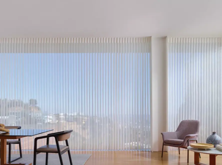
- Soft sheers that let light diffuse gently.
- Pastel or neutral roller shades for clean minimalism.
Keep it cohesive: Choose trims and hardware in brushed metals (like brass or brushed nickel) that complement the softness.
Tonal Home Flow → Coordinated Undertones
If you’re using related hues across rooms:
- Select window treatments that share undertones with adjacent spaces e.g., warm neutrals throughout, shifting from lighter to deeper throughout the house.
Example: A living room with warm taupe walls might use cream linen drapes, while an adjacent dining room with deeper terracotta uses latte woven shades — related but distinct.
Final Tips for a Polished Look
Texture matters more than pattern: In 2026 interiors, tactile fabrics (linen, cotton, velvet, natural weaves) elevate simple color pairings.
Consider daylight: Light quality changes how paint reads — always view swatches near your windows.
Consider daylight: Light quality changes how paint reads — always view swatches near your windows.
Balance mood: Bold paint needs calming treatments; soft walls can handle richer textures.
Enhance Your Living Space with Texeuro Drapery’s Accessibility
Solutions Stop by our showroom or contact Texeuro Drapery Ltd. for a personalized consultation. We are the largest home and décor centre in the GTA, specializing in window shades, blinds and shutters, drapery, curtains, custom duvets, pillows, headboards, and more.
Contact us at +1 905-629-9575 to get quality motorized window treatments.